Rajasthan Board RBSE Class 11 Economics Chapter 7 Presentation of Data
RBSE Class 11 Economics Chapter 7 Text book Questions
RBSE Class 11 Economics Chapter 7 Multiple Choice Questions
Question 1.
Which diagrams are used to compare two or more than two related numeric groups on basis of properties of time or place?
(a) Simple bar diagram
(b) Multiple-bar diagram
(c) Inter-segregated bar diagram
(d) Rectangular diagram
Answer:
(b) Multiple-bar diagram
Question 2.
In order to construct a circle, it is necessary to know:
(a) Square
(b) Side
(c) Radius
(d) Sphere
Answer:
(c) Radius
![]()
Question 3.
What is circular diagram?
(a) A Radius
(b) Two-dimensional
(c) Three-dimensional
(d) All of these
Answer:
(b) Two-dimensional
Question 4.
If 40 percent of the women in India are literate, to show its proportion in circular diagrams the angle used will be:
(a) 60 degrees
(b) 72 degrees
(c) 144 degrees
(d) 40 degrees
Answer:
(c) 144 degrees
Question 5.
In which series can mode be determined using frequency diagrams?
(a) Individual series
(b) Continuous series
(c) Discrete Series
(d) Exclusive series
Answer:
(b) Continuous series
Question 6.
This is not a two-dimensional diagram:
(a) Bar diagram
(b) Square diagram
(c) Rectangular diagram
(d) Circular diagram
Answer:
(a) Bar diagram
Question 7.
Graphical presentation is done:
(a) On plain paper
(b) On graph paper
(c) On Drawing sheet
(d) On any of these
Answer:
(b) On graph paper
RBSE Class 11 Economics Chapter 7 Very Short Answer Type Questions
Question 1.
What is meant by Line diagram?
Answer:
This is a one-dimensional diagram. When the item-values related to a fact are large in number and the difference between the lowest and highest value in the series is less, then in such a situation, Line Diagrams are used.
![]()
Question 2.
Through which diagram can mode be determined?
Answer:
With the help of frequency rectangular diagram, mode can be determined.
Question 3.
Explain tabulation.
Answer:
Tabulation is an ordered/sequential arrangement of presenting data in rows and columns.
Question 4.
Mention any three ways of presenting data.
Answer:
Following are three ways of presenting data :
- Subjective or Descriptive Presentation
- Tabulation
- Diagrammatic Representation of Data items
Question 5.
Write any four points about the utility of diagrams.
Answer:
Following are the four points about the utility of diagrams:
- Attractive and Effective
- Simple and Comprehensible presentation
- Economy of labour and time
- Helpful in comparison
Question 6.
Write the names of two-dimensional diagrams.
Answer:
Following are the names of two-dimensional diagrams;
- Rectangular Diagram
- Square Diagram
![]()
Question 7.
Construct a frequency rectangular diagram (histogram).
Answer:
RBSE Class 11 Economics Chapter 7 Short Answer Type Questions
Question 1.
Clarify the difference between tabulation and classification.
Answer:
Following are the differences between Tabulation and Classification :
- Firstly, the unorganized data is classified and it is presented in various series. Thus, classification is the basis of tabulation.
- In classification, the collected data-items are divided into various classes or series on basis of their similar or dissimilar properties, whereas in tabulation, the classified facts are presented in rows and columns.
- Classification is a method of statistical analysis, while tabulation is a process of presentation of data-items.
- Data-items are divided into classes and sub-classes in classification, while in tabulation, these are kept under headings and sub-headings.
Question 2.
What is the difference between diagrammatic and graphical presentation?
Answer:
Difference between Diagrammatic and Graphical Presentation
| Diagrammatic Presentation of Data | Graphical Presentation |
| 1. In diagrams, lines, bars, rectangles, circles, pictures and maps are used. | 1. In graphical presentation, dots, dashes, dot-dashes and curves are used. |
| 2. Diagrams can be drawn on plain papers and graph papers | 2. Graphs can only be drawn on graph papers. |
| 3. These are attractive and effective. | 3. These are simple. |
| 4. This saves time and labour. | 4. This makes complex data simple and understandable. |
Question 3.
Which things should be kept in mind while drawing a graph?
Answer:
The following should be kept in mind to make drawing of a graph:
- Accuracy :
While giving an attractive form to diagrams accuracy must be taken care of, since confusing results are obtained from inaccurate and erroneous pictures. - Suitable size :
There is no definite rule about the size of diagrams. The diagram should neither be too large nor very small. Diagrams should be constructed in accordance with the size of paper on which they are drawn. - Index :
While constructing the diagram; the various symbols used(points, lines , shades, rectangles, etc.) must be clarified, giving indications on the bottom-right comer of the diagrams so that the picture could be understood clearly. - Simplicity :
In order to understand the diagram easily, it should generally be simple. This prevents confusion for the reader.
![]()
Question 4.
Explain any four points of utility of diagrams.
Answer:
Following are the four points of utility of diagrams:
- Attractive and Effective :
Pictures leave a lasting impression on one’s mind. Being attractive and effective, these quickly draw people’s attention towards them. - Economy of labour and time :
Often, much labour and time is expended in understanding data-items and obtaining results from them. On the other hand, all qualities of data-items can be easily understood in less time and without any technical knowledge, with the help of diagrams. - Helpful in comparison :
Various facts can be compared using diagrams. Pictorial comparison is more effective than numeric comparison. - Extensive use :
Statistical diagrams are extensively used in all spheres of life.
Question 5.
On which basis can tables be classified?
Answer:
Tables can be classified on the following basis :
- According to Objective :
General-objective table has no specific objective. It is also called a reference table. Special objective table is prepared to fulfill a specific objective. Its size is smaller than that of an ordinary table. It is also called concise or analytical table. Mean, percentage, ratio, etc. are used in it. - According to Originality :
Data items are presented in their original form in primary ‘ table. It is also called classification table. In a derived table, besides original data-items, items obtained from them like-sum, percentage, ratio, multiple, etc. values are also presented. - According to Construction :
When data-items are presented on basis of only one property, it is called a simple table. For example, distribution of population according to the age/gender/states, etc. To distribute population on the bases of age, gender and literacy together, the data items are presented using a triple property table. Tables can be single-property, dual property, triple property or multi-property.
![]()
RBSE Class 11 Economics Chapter 7 Long Answer Type Questions
Question 1.
Clarify the meaning of tabulation. Which are the various parts of table? Which rules should be kept in mind while constructing a table?
Answer:
The process of presentation of classified data in tables to render it simple and concise, is called tabulation. It is an ordered/sequential arrangement of presenting data in rows and columns.
According to Prof. Neiswanger :
“A statistical table is a systematic organization of data in columns and rows.”
According to Prof. H. Secrist :
“Tables are a means of recording in permanent form the analysis that is made through classification and of placing in juxtaposition things that are similar and should be compared.”
Following are the main parts of a table :
- Table number :
A table is assigned a number for its identification. It should be marked at the very top of the table. - Title/Heading :
The title of the table indicates the subject of the table. This title should be clean, brief and in suitable language. This should be written next to or adjacent to the table number. - Stubs and captions :
Each row of the table is given a title. The title of row is also called stub. These are given in, the column left of the table. Each column of the table has a heading above it. This is called the caption or column title, - Main body of the table :
Facts/data-items are presented in the main body of the table. This is the heart of the table. Its shape/size depends on the nature and availability of the data-items. Its size and form is planned in advance. - Drawing lines and leaving blank spaces :
The beauty of a table depends on drawing . lines and leaving blank spaces. While line should be short or thick or which colour be used to draw it- all things depend on the available subject information. - Arrangement of Items :
The arrangement of well-organised and ordered items makes the table attractive and useful. Those cells which are to be compared are kept as close as possible. - Unit of measurement :
If the unit of measurement is same throughout the table then the unit of measurement should be written along with title of the table. - Foot notes :
If some necessary information related to data items has been left out in the table or if special clarification about a fact is needed, then an explanatory footnote is given for it at the bottom of the table. - Source :
To make the data-items authentic and more effective, the context and source of data-items should be made clear at the end of the table.
We should keep following rules in mind while constructing a table:
- Title :
Each table should have a clear, complete and brief title. The title should indicate the subject related to the data-items, time, classification basis, etc. - Columns and rows :
Keeping in mind the objective of tabulation and the available information, the number of cells and rows should be ascertained before hand. Serial number should be marked on columns. - Comparison :
Comparable data-items should be kept as close as possible in a table. Percentage, ratio, multiple, etc. derived values should also be kept close to their original values (data-items in nearby cells) with a viewpoint of convenience in comparison. - Lines :
Important information should be placed in cells having thick and deep lines, so that they attract the reader’s attention readily. - Arrangement of items :
Different terms should be arranged in the table according to importance, size, place, time or alphabetically. Data-items with greater importance should
be placed in leading columns, while those with less importance should be kept in trailing columns. - Special Importance :
To attract attention towards information of special importance, these should be written in bold/thick numerals. - Footnotes :
If some necessary information has been left out in the table or if special clarification is needed about a certain data-item, then a footnote should be given below the table. - Sources :
The source/origin of the data-items present in the table should be mentioned below the table.
![]()
Question 2.
Construct an empty table to present the population distribution on the basis of education, employment and gender in a city.
Answer:
Distribution of population on the basis of Education, Employment and Gender
| Education | Employment | Gender | ||||||
| Male | Female | Total | Male | Female | Total | Male | Female | Total |
Question 3.
Give a brief description of various kinds of diagrams that are used generally for the presentation of statistical facts.
Answer:
Following are the various kinds of diagrams that are used generally for the presentation of statistical facts:
- Line Diagrams :
This a one-dimensional diagram. When the item-values related to fact are large in number and the difference between the lowest and highest value in the series is less, then in such a situation, Line Diagrams are used. The difference between all the lines is kept the same and vertical line is drawn equal to each item-value. These lines are not thick and thus are less attractive. The values depicted here can be studied comparatively. - Simple Bar Diagrams :
This is also a one-dimensional diagram. Simple bar diagrams are made when the item-values related to a fact are less in number. The difference between line diagram and bar diagram is that while no width is made in line diagram, bar diagram has width in lines, which makes the diagram attractive. Diagrams having height in proportion to the item-values and equal widths are called simple bar diagrams. Equal difference is kept in these diagrams. Bar diagrams can be of both types, vertical and horizontal. These diagrams are more suitable for presentation of individual series, time series and place-oriented data item series. - Rectangular Diagrams :
These are two-dimensional diagrams. Only one extension(height/ length) is considered in one-dimensional diagrams, while two-dimensional diagrams are constructed considering two extensions: height and width. The areas of two-dimensional diagram are in proportion to item-values, hence these are also called surface diagrams or area diagrams. For mutual comparison of two or more than two quantities, rectangular diagrams are used. Rectangular diagrams are of two types:- Percentage Inter-segregated Rectangular diagram
- Divided Rectangular diagram
- Circular or Pie Diagram :
Circular diagrams are constructed in the same way as square diagrams. These two are two-dimensional diagrams. In order to construct circular diagrams, the square roots of given values are determined. The radii of circles are calculated in proportion to the square roots. Circles are drawn on basis of these radii. Circles should be made on the same plane and the difference between them is kept equal. Circular diagrams can be internally divided into their sub-divisions, which can be used for comparison. In order to construct these diagrams, the total of all heads(items) is taken to be 360° and then the angles of various heads are calculated. Since the circle’s centre describes an angle of 360°, these are also called angular diagram or circular section diagram.
RBSE Class 11 Economics Chapter 7 Other Important Questions
RBSE Class 11 Economics Chapter 7 Objective Type Questions
Question 1.
Bar-Diagram
(a) One-dimensional diagram
(b) Two-dimensional diagram
(c) Dimension-less diagram
(d) None of these
Answer:
(a) One-dimensional diagram
Question 2.
You can get the following information graphically from the data presented through the rectangle diagram
(a) Mean
(b) Mode
(c) Median
(d) All of these
Answer:
(b) Mode
Question 3.
By the archway, the situation of the following can be known in graphical form,
(a) Mode
(b) Mean
(c) Median
(d) None of these
Answer:
(c) Median
![]()
Question 4.
The data presented by arithmetic line diagram helps explain the following:
(a) Long-term tendency
(b) Cyclicity in data
(c) Data in the activity
(d) All of these
Answer:
(a) Long-term tendency
Question 5.
The simplest form of graphical presentation
(a) Simple Bar Diagram
(b) Square Diagram
(c) Circular Diagram
(d) None of these
Answer:
(a) Simple Bar Diagram
Question 6.
Graphical presentation of data is useful because
(a) These are attractive and effective
(b) These are helpful in comparative study.
(c) It makes the facts simple and intelligible.
(d) All of these
Answer:
(d) All of these
Question 7.
Mode is calculated
(a) By the Bar Diagram
(b) By the Square Diagram
(c) By the Cumulative Frequency Curve or Ogive
(d) None of these
Answer:
(b) By the Square Diagram
Question 8.
When a table gives two types of information, then it is called
(a) Simple Table
(b) Two-dimensional series
(c) Three-dimensional series
(d) Multi-attribute Table
Answer:
(b) Two-dimensional series
Question 9.
An appropriate diagram of displaying data related to the number of allopathic and homoeopathic physicians registered in six different regions
(a) Line Graph
(b) Square Diagram
(c) Pie Diagram
(d) Double Bar Diagram
Answer:
(d) Double Bar Diagram
![]()
Question 10.
Are rectangle diagrams and column diagrams the same methods for presenting data?
(a) Yes
(b) No
(c) Cannot be said
(d) None of these
Answer:
(a) Yes
RBSE Class 11 Economics Chapter 7 Very Short Answer Type Questions
Question 1.
What is tabulation?
Answer:
To present data in columns and rows sequentially is called tabulation.
Question 2.
What is a complex table?
Answer:
A complex table refers to a table which reveals more than one quality of the data. Question 3. What are the main parts of a table?
Answer:
- Title/Heading
- Body
Question 4.
What is Bar-Diagram?
Answer:
Bar diagram is a picture in which the data is displayed through bars and rectangles.
Question 5.
What is Multi-Bar Diagram?
Answer:
The multi-bar diagram means a diagram that displays data of two or more facts through bars.
Question 6.
What is Circular Diagram?
Answer:
A circular diagram is a picture in which a circle is divided into several parts and the relative values are displayed.
Question 7.
State the two characteristics of Bar Diagram.
Answer:
- The length of the bars changes according to the value.
- These bars are made at equal distances.
![]()
Question 8.
Explain a characteristic of tabulation.
Answer:
Simple and brief presentation
Question 9.
In how many ways is data usually presented?
Answer:
Data is usually presented in three ways.
Question 10.
Write a difference between tabulation and classification.
Answer:
In classification the data is divided into classes and sub-classes whereas in tabulation, the data is divided into headings and sub-headings.
Question 11.
Into how many types have the tables been divided?
Answer:
The tables have been divided into three types.
Question 12.
Into how many types have the tables been divided according to objectives?
Answer:
In Two Types
Question 13.
Into how many types have the tables been divided according to originality?
Answer:
In Two Types
Question 14.
Explain two cautions which should keep in mind, when making tables?
Answer:
- The title should be clear, complete and brief.
- The structure of rows and columns should be decided previously.
![]()
Question 15.
Write any one merit of diagrammatical presentation.
Answer:
Simple and understandable presentation
Question 16.
How many types of statistical diagrams are there?
Answer:
Five
Question 17.
What will be extracted first from the given values to create circular diagrams?
Answer:
Square root will be extracted first.
Question 18.
Which are the two methods of presenting data?
Answer:
- Diagrammatical Presentation
- Graphical Presentation
Question 19.
What do you mean by diagrammatical presentation?
Answer:
Diagrammatical presentation means to present data in the form of bars, diagrams, rectangular diagram, circular diagram, etc.
Question 20.
What can be determined with the help of cumulative frequency curves?
Answer:
Median can be determined with the help of cumulative frequency curves.
Question 21.
On which side does the ‘less than’ curve fall?
Answer:
Falls downwards.
Question 22.
On which side does the ‘More than’ curve fall?
Answer:
‘More than’ curve is raised upwards.
![]()
Question 23.
The point at which the ‘less than’ and ‘more than’ curves intersect each other, is called?
Answer:
Median point
Question 24.
Generally, in how many ways is data presented? Name them.
Answer:
Data are presented in three ways-
- Subjective or descriptive presentation
- Tabulation
- Graphical presentation
Question 25.
For which data is the subjective or descriptive presentation useful?
Answer:
It is useful for data of less magnitude.
Question 26.
Write three objectives of tabulation.
Answer:
- Presenting data-items in an organized manner.
- Presenting data-items concisely and in a stable form and
- Rendering the problem more simple and clear.
Question 27.
Explain any two points of importance of tabulation.
Answer:
Following are the two points of importance of tabulation-
- Simplicity :
Essential information can be very quickly and easily understood through tabulation and the complexity of data-items is eliminated. - Comparative Study :
Similar and comparable data are kept in mutually proximal rows, so that their comparative study could be done easily.
Question 28.
What is table number?
Answer:
A table is assigned a number for its identification. It should be marked at the very top of the table.
![]()
Question 29.
What do you mean by title?
Answer:
The title of the table indicates the subject of the table. This title should be clear, brief and in suitable language.
Question 30.
What is simple table?
Answer:
When data-items are presented on basis of only one property, it is called a simple table.
Question 31.
What should be kept in mind to make the diagrams attractive and effective?
Answer:
- Attractiveness and tidiness
- Accuracy
- Appropriate Size
- Headings and Footnotes
- Selection of Measurement
Question 32.
When are the line diagrams used?
Answer:
When the item-values related to a fact are large in number and the difference between the lowest and highest value in the series is less, then in such a situation, Line Diagrams are used.
Question 33.
When are the simple bar diagrams made?
Answer:
Simple bar diagrams are made when the item-values related to a fact are less in number.
Question 34.
When are the segregated rectangular diagrams used?
Answer:
These diagrams are used to present varying but mutually related facts, diagrammatically.
![]()
Question 35.
When is the double table constructed?
Answer:
When only two properties of data are included then double table is created.
Question 36.
When are the frequency rectangular diagrams used?
Answer:
The frequency rectangular diagrams are used for the presentation of continuous series data.
Question 37.
What is the meaning of frequency polygon?
Answer:
The multi-sided diagram made on the basis of item values or mid-points, and mid-points and their frequencies is called frequency polygon.
Question 38.
How can the frequency curve be presented?
Answer:
Frequency curve can be presented very easily by moving closest to the points (vertices) of frequency polygon and drawing a free-hand curve.
Question 39.
In which form is the grouped frequency distribution presented?
Answer:
The grouped frequency distribution is presented in the form of frequency rectangular diagram, frequency polygon, frequency curve, cumulative frequency curve, etc.
Question 40.
What is percentage bar diagram?
Answer:
Percentage bar diagram is a method in which the various parts of values are presented in the form of percentage. Assuming some value as 100, the percentage of the value of all items is computed.
![]()
RBSE Class 11 Economics Chapter 7 Short Answer Type Questions
Question 1.
What are the main objectives of tabulation?
Answer:
Following are the main objectives of tabulation-
- The purpose of tabulation is to present classified data in a systematic and orderly form.
- An objective of tabulation is to present the statistical data briefly and in less space.
- Its purpose is to provide the facts comparatively.
- The purpose of tabulation is to simplify and clarify the problem.
- It makes data comprehensible.
Question 2.
What are the main forms of table?
Answer:
Following are the main forms of table :
- Table according to objective.
- Table with general objectives
- Table with special objectives
- Table according to originality
- Primary Table
- Derived Table
- Table according to construction
- Simple Table which shows one property.
- Complex Table
Complex Table :
The table is divided into 3 types they are
- Table of dual property
- Table of triple property
- Table of multi- property
![]()
Question 3.
What do you understand by the dual-property table?
Answer:
Dual-property Table – The dual-property table represents the two characteristics of data. The example of this table is given below:
Dual-Property Series
| Class | No. of Students | Total | |
| Boy Student | Girl Student | ||
| B.A. | 1200 | 400 | 1600 |
| B.Com | 800 | 200 | 1000 |
| B.Sc | 300 | 100 | 400 |
| Total | 2300 | 700 | 3000 |
Question 4.
State any four common rules of table formation.
Answer:
Following are the four common rules of table formation:
- The title of table should indicate the subject-related objectives.
- The size of a table should be appropriate.
- Table should be easy and Ideal.
- The source of origin of the data items presented in the table should be mentioned below the table.
Question 5.
What- do you understand by graphical presentation?
Answer:
Meaning of Graphical Presentation :
Presentation of statistical data on graph paper is called graphical presentation. Graphical presentation is a form of diagrammatic display. Continuous curves are created in graphic presentation. Graphical presentation is used for the display of time range and frequency distribution. From mathematical point of view, graphic lines are called algebraic and geometrical alphabet.
Question 6.
What do you understand by artificial base line?
Answer:
Artificial base line is a method of magnifying the small fluctuations in a time series. There are certain instances where the dependent variables have got very small differences in values and the smallest value is very far distant from the origin. Under these circumstances, if we start our scale from zero on the Y-axis, the plotted values will show a straight line. In order to present such values, we use the technique of ‘artificial base line’.
![]()
Question 7.
Describe the merits of graphical presentation.
Answer:
The following are the merits of Graphical Presentation:
- Diagrammatic presentation implies presenting data-items in simple and easy manner.
- The statistical numbers shown by diagrammatic presentation are kept in mind for a longer period of time.
- It is a very attractive and effective means.
- Various facts can be compared using diagrams.
- Pictures, besides providing information about data items, also entertain us.
- This helps in calculating the averages like median, mode and quartiles.
- The relationship of correlation between two variables is also gained with its help.
- Special knowledge or training is not required to understand it.
Question 8.
What is the meaning of rectangular diagram?
Answer:
These are the two-dimensional diagrams. Only one extension (height/length) is considered in one-dimensional diagrams, while two-dimensional diagrams are constructed considering two extensions: height and width. The areas of two-dimensional diagrams are in proportion to item- values, hence these are also called surface or area diagrams.
Question 9.
Explain the process of constructing simple bar diagram with an example.
Answer:
In this method, the data are presented with the help of bars. These bars are usually arranged according to relative magnitude of the items. In this diagram one bar is drawn for each value or item and the length of the bar is based on the value of item. The bars must have the similar width and uniform space should be kept between the two bars. These diagrams can be drawn either vertically or horizontally, but bars on vertical base are more common.
The use of simple bar diagram is. considered appropriate in presenting data of individual series, time series or spatial series.
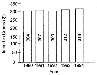
Example : Make a bar diagram with the following data
| Year | 1990 | 1991 | 1992 | 1993 | 1994 |
| Import (In Crores) | 304 | 307 | 300 | 312 | 316 |
Question 10.
What is the meaning of multiple bar diagram?
Answer:
In a multiple bar diagram where, two or more interrelated data is represented. For example : Bar diagram to show birth rate and death rate or bar diagram for export-import. In this type of bar diagram, various bars are made for the different facts and the bars related to the same place or time are made matching with one another. And bars of another place and time are made leaving some space in between. The technique of drawing such a diagram is the same as that of simple bar diagram. The only difference is that since more than one phenomenon is represented, different shades, colours, dots or crosses are used to distinguish between the bars. Wherever a comparison between two or more related variables is to be made, multiple bar diagram should be preferred.
![]()
Question 11.
Explain the tables according to objectives.
Answer:
Ordinary objective table has no specific objective. It is also called a reference table. Special objective table is prepared to fulfill a specific objective. Its size is smaller than that of an ordinary table. It is also called concise or analytical table. Mean, percentage, ratio, etc. are used in it.
Question 12.
Explain any five rules in the composition of the table. Or What things should be kept in mind while constructing a table?
Answer:
We should keep the following rules in our mind while constructing a table:
- Title/Heading :
Each table should have clear, complete and brief title. The title should indicate the subject related to the data-items, time, classification basis, etc. - Cells and Rows :
Keeping in mind the objective of tabulation and the available information, the number of columns and rows should be ascertained beforehand. Serial numbers should be marked on cells. Their title should be clear and brief and the unit of measurement should also be mentioned. - Comparison :
Comparable data-items should be kept as close as possible in a table. Percentage, ratio, multiple, etc. derived values should also be kept close to their original values (data-items in nearby cells) with a viewpoint of convenience in comparison. - Special Importance :
To attract attention towards information of special importance, these should be written in bold/thick numerals. - Lines :
Important information should be placed in cells having thick and deep lines, so that they attract the reader’s attention readily.
Question 13.
Explain the four benefits/utility of the diagrammatical presentation of data.
Answer:
Following are the four benefits/utility of the diagrammatical presentation of data:
- Attractive and Effective: Pictures leave a lasting impression on one’s mind. Being attractive and effective, these quickly draw people’s attention towards them. Subjects that cannot be understood by figures (numbers) can be easily understood with the help of diagrams.
- Simple and Comprehensible presentation: Complex, unorganized and uninteresting data-items can be made simple and easily understandable, using diagrams. It does not require taxing one’s mind.
- Economy of labour and time: Often, much labour and time is expended in understanding data-items and obtaining results from them. On the other hand, all qualities of data-items can be easily understood in less time and without any technical knowledge, with the help of diagrams.
- Extensive use: Statistical diagrams are extensively used in all spheres of life. Business, commerce, advertising, tourism, education, medicine, etc. fields are those where diagrams have immense importance.
![]()
Question 14.
Explain any four rules to make the diagram attractive and effective.
Answer:
Following are the four rules to make the diagram attractive and effective:
- Attraction and Cleanliness :
Diagrams are visual aids for the presentation of statistical data. Besides being pleasant to the eyes, they leave a lasting impression on the mind. Thus, diagrams should be clean/neat, interesting and attractive. - Accuracy:
While giving an attractive form to diagrams, accuracy must be taken care of, since confusing results are obtained from inaccurate and erroneous pictures. - Index :
While constructing the diagram, the various symbols used (points, lines, shades, rectangles, etc.) must be clarified, giving indications on the bottom right comer of the diagram, so that the picture could be understood clearly. - Simplicity:
In order to understand the diagram easily, it should be generally simple. This prevents confusion for the reader.
Question 15.
Explain the Line diagram.
Answer:
This is one-dimensional diagram. When the item-values related to a fact are large in number and the difference between the lowest and highest value in the series is less, then in such a situation, Line Diagrams are used. Here, the difference(spacing) between all the lines is kept the same and vertical line is drawn equal to each item-value. These lines are thick and thus are less attractive. The values depicted here can be studied comparatively.
Question 16.
Explain the percentage inter-segregated rectangular diagram.
Answer:
Percentage inter-segregated rectangular diagram :
The budgets of various families can be mutually compared using such diagrams. Assuming the total income in these diagrams to be 100%, the expenditure on various heads is converted into percentage. For each family rectangles of equal height equal to 100 are constructed. The width of these rectangles is kept in proportion to total expenditure. Then on basis of percentage quantities of expenditure done on various heads, the rectangle is divided into various sections.
![]()
Question 17.
Explain the cumulative frequency curve.
Answer:
Cumulative Frequency Curve :
When the upper limits of class-intervals are taken on X-axis and cumulative frequencies are taken on Y-axis and a curve is thus plotted, it is called a cumulative frequency curve. Median and other division values (one-fourth, one-tenth, one- eighth, one-hundredth) can be easily determined with the help of cumulative frequency curves.
Question 18.
Explain the frequency polygon.
Answer:
Frequency Polygon :
The multi-sided diagram made on the basis of item values or mid-points, and mid-points and their frequencies is called frequency polygon. The diagram is prepared taking continuous/discrete series values on X-axis and frequencies on Y-axis. Then by joining the top most points together and joining the first and last points with the base line, the frequency polygon is constructed.
RBSE Class 11 Economics Chapter 7 Long Answer Type Questions
Question 1.
Clarify the meaning of tabulation. Explain its objectives and limitations.
Answer:
Meaning of Tabulation :
The process of presentation of classified data in tables to render it simple and concise, is called tabulation. It is an ordered/sequential arrangement of presenting data in rows and columns. “Tabulation” is an orderly arrangement of data in columns and rows, done systematically in a tabular form. It is the logical listing of related quantitative data in vertical columns and horizontal rows with explanatory and qualifying words, phrases and statements along with titles, headings and notes.lt is one of the old methods of presenting data in a condensed and readily comprehensible form.
According to Prof. Neiswanger :
“A statistical table is a systematic organization of data in columns and rows.”
According to M.M.Blair :
“Tabulation in its broadest sense is any orderly arrangement of data in columns and rows.”
According to Prof. H. Secrist :
“Tables are a means of recording in permanent form the analysis that is made through classification and of placing in juxtaposition things that are similar and should be compared.”
Following are the objectives of tabulation :
- To Simplify Complex Data:
Tabulation is a scientific process involving the presentation of classified data in an orderly manner. When data are tabulated, all unnecessary details and repetitions are avoided. Thus, data become simple and easily understandable. - To Present the Data in a Minimum Space:
It presents facts in minimum possible space and unnecessary repetitions and explanations are avoided. Moreover, the needed information can be easily located. - To Facilitate the Data for a Comparative Study:
Tabulation facilitates the comparison of data. The table is divided into various parts on the basis of rows and columns and their totals, sub-totals and grand totals are given in such a manner that data may be understood easily in comparative terms. - To Clarify the Characteristics of Data:
The headings and sub-headings of a table clarify the characteristics of data, which helps in the analysis of problems.
Following are the limitation of tabulation :
- Only data are included under tabulation, while their description is not included. That’s why it is not possible to understand them easily.
- It is not possible to present qualitative facts in tables.
- While creating a table the data must also be created. This is the reason that its accuracy decreases.
- Individual characteristics of data end in tabulation.
- Tabulation is done only for special purpose. For this reason, it is not used successfully for other purposes.
- The context of the summaries displayed due to limited space in the tabulation is often not clear.
![]()
Question 2.
Describe briefly the main characteristics of an ideal statistical table.
Answer:
The construction of an ideal and well-structured table depends on the constructor’s intellectual level, and the purpose of the table. An ideal statistical table should have the following characteristics
- Title suited to the purpose of the study :
The heading of the table should be given at the top-centre of the table. This title should be suited for the purpose of the study. - Comparison :
To facilitate comparison, comparative data of the table should be kept in adjacent cells. - Arrangement of items :
The arrangement of systematic and orderly items makes the table more, attractive and useful in understanding. The cells which are to be compared should also be kept as close as possible. - Ideal Shape :
The size of the table should be reasonable and balanced. A very large table is not considered ideal. - Percentage and Ratio :
If necessary, the percentage or ratio of the data should be revealed in the table. - Easy and Beautiful :
The table should be simple and easy to understand and should be beautiful to look at. - Total :
The sum of each class and sub-class should be given in the table. - Source of Table :
Below the table, it should be written, where the data is derived from. - Unit of Measurement :
The units used in the table should be written in front of the column or in front of the caption. - No. of Table :
The number of each table should be given at the top of the table. - Construction on scientific basis :
The construction of the table should be on a scientific basis and the data displayed in it should be arranged properly. - Cells of Table :
Cells of statistical data should be made in such a way that the characteristics of the data and their importance can be suitably conveyed.
Question 3.
Explain the different types of tables.
Answer:
The table is classified mainly on three bases- 1. According to Objectives 2. According to Originality 3. According to Construction
I. According to objectives :
Tables are of two types according to objectives
- Table with General Purpose:
This table presents the data in tabulated form for , general use. Its purpose is to present data so that researchers can add different units immediately. These are also called reference tables because usually it is given with reports; Like – Table given with census report. - Table of Specific Purpose:
This table is prepared for a particular purpose. This table is mostly small, in which detailed data is not provided, these are also called summary tables.
II. According to Originality :
Tables are of two types according to originality-
- Primary Table :
The primary table refers to such a table in which the data is presented in the same fundamental form, in the same way as they have been collected. - Derived Table :
The derived table is the table in which data is presented in form of percentage, ratio, etc.
III. According to Construction :
Tables are of two types according to construction-
- Simple Table :
This table only describes one attribute of data. For example, a table showing the number of students in different classes of a school. - Complex Table :
A table Which explains more than one properties of relationships is called a complex table. Based on the properties, it is classified as 3 classes, which are the following:- Dual-Property Table :
This table displays two properties of data, so it is called a dual-property table. For example – If the number of students studying in different classes in a school is divided into boys and girls, then such table will be called dual property table. - Triple-Property Table :
Such tables show three characteristics of data. For example, if the number of students studying in school is expressed on the basis of class, gender and housing, then such a table will be called a triple property table. - Multiple-Property Table :
When the table displays more than 3 characteristics of data, then it is called multi-property table. For example – If the number of students of the school is distributed by the class, gender, housing, family income, then this table is called multi-property table.
- Dual-Property Table :
![]()
Question 4.
How many types of complex tables are there? Explain each with examples.
Question
Types of Complex Tables- Complex tables are of three types
(i) Dual-Property Table :
These tables represent the two characteristics of data. Its example is given below
Number of Students in College in 2009-10 (According to Class and Gender)
| Class | No. of Students | Total | |
| Boy Student | Girl Student | ||
| B.A. | 1200 | 400 | 1600 |
| B.Com | 800 | 200 | 1000 |
| B.Sc | 300 | 100 | 400 |
| Total | 2300 | 700 | 3000 |
(ii) Triple-Property Table :
Three properties of data are displayed in such a table. Presentation of the students on the basis of class, gender and residential status will be in the category of triple-property table. The example is as follows
Number of Students in College in 2009-10 (On the basis of Class, Gender and Residence)
| Class | Boys | Girls | Total | ||||||
| Rural | Urban | Total | Rural | Urban | Total | Rural | Urban | Total | |
| B.A. | 600 | 600 | 1200 | 100 | 300 | 400 | 700 | 900 | 1600 |
| B.Com | 200 | 600 | 800 | 50 | 150 | 200 | 250 | 750 | 1000 |
| B.Sc. | 80 | 220 | 300 | 20 | 80 | 100 | 100 | 300 | 400 |
| Total | 880 | 1420 | 2300 | 170 | 530 | 700 | 1050 | 1950 | 3000 |
(iii) Multiple-Property Table :
In this table, more than 3 characteristics of data are displayed. The example of school students divided on the basis of residential status, marital status, class and gender has been given further.
Number of Students in College in 2009-10 (On the basis of Class, Gender, Residence and Marital Status)
| Class | Boys | Girls | |||||||
| Rural | Urban | Rural | Urban | Total | |||||
| Marr. | In mrn | Marr. | U nmm | Marr | U nmm | Marr | U nmm | ||
| B.A. | 50 | 550 | 10 | 590 | 25 | 75 | 25 | 275 | 1600 |
| B.Com | 20 | 180 | 20 | 580 | 20 | 30 | 25 | 125 | 1000 |
| B.Sc. | 5 | 75 | 10 | 210 | 2 | 18 | 5 | 75 | 400 |
| Total | 75 | 805 | 40 | 1380 | 47 | 123 | 55 | 475 | 3000 |
![]()
Question 5.
What do you mean by presentation of data by line diagram? What are its advantages and limitations? Explain.
Answer:
Line Diagram :
The presentation of statistical data on graph paper is called a graph or line diagram. Generally, this type of graph is constructed to display the data of a known series. Therefore, a line diagram is also commonly known as Histogram Chain graph. The graph is merely part of the display. Describing graph, Blair has written, “The simplest to understand, the easiest to make, the most variable and the most widely used type of chart is the line graph.”
This is a one-dimensional diagram. When the item-values related to a fact are large in number and the difference between the lowest and highest value in the series is less, then in such a situation, Line Diagrams are used. Here, the difference(spacing) between all the lines is kept the same and vertical line is drawn equal to each item-value. These lines are thick and thus are less attractive. The values depicted here can be studied comparatively.
The graphical presentation is composed on graph paper. Lines on this paper are drawn in horizontal and vertical direction, which cut each other at right angles. This point of intersection is called the original point or zero point. The horizontal line is called the X-axis and the vertical line is called’the Y-axis. Negative and positive measurements on the point line are both inscribed from the original point. Measures towards the upper right side are positive and negative at the bottom or left. Normally, independent variables are obtained on horizontal scale and dependent variables on the vertical scale. Scales for X and Y axis are determined independently.
Advantages of graphical presentation :
Following are the advantages of graphical presentation:
- Easy and understandable :
With the help of a graphical presentation, complex data can be made simple and easy to understand. Only the conclusive facts of the data are seen in them. - Attractive and Effective :
Graph or line diagrams are attractive and effective. It leaves an indelible impression on the mind. It is said that a picture is equal to a thousand words. - No special training and knowledge is needed :
No special training and knowledge is needed to understand the data presented by the line diagram. They can be understood by a common person easily. - Long Effect :
Line diagrams have a long-term effect on the mind. It is not possible to forget them easily. - Easily Comparable :
Data is easily compared with the help of these line diagrams. - Entertainment :
Line diagrams give simple and effective presentation of various topics, and also entertain the viewer. Thus, as well as getting information from these, entertainment is also done. - Determination of averages :
The mode, median and quartile, etc. can also be calculated with the help of these. - Study of correlation :
With the help of these, there is convenience in understanding the correlation between two variables.
Limitation of Graphical Presentation
- Primary Conclusion :
It is not always possible to get the final conclusions through these, only general information can be obtained from them. - Limited Use :
Graphs or line diagrams are more useful only in the comparative study. - Misuse :
Often the facts are misrepresented by line diagrams. This often happens in advertisements.
![]()
Question 6.
Explain the need and importance of diagrams in statistics.
Answer:
Statistical facts, when presented in the form of numbers, are not understood by ordinary people, nor do they arouse their interest. Also, it is possible for them to compare between these different types of data and draw a conclusion, but when these data are displayed in diagrams, they become very easy for them to understand various facts. M.M.Blair correctly said that “Linear arithmetic gives such information in just 5 minutes, which takes many whole days for a data-table to make it intelligible”.
It is thus clear that the use of diagrams in statistics is very important. The following are the major reasons for the need or utility of statistical diagrams:
- To make data easy and interesting :
There is the ability in a diagram to present data in a simple and interesting form. Through the diagrams, all the features of the data become clear. For example, if the progress of 2 schools is to be studied, it can be done in more simpler form with the help of diagrams. - Economy of time and labour :
When data is presented in the form of diagrams, it can be easily understood in a short time without taxing the brain, therefore it can save time and labour. - Helpful in comparison-
Various facts can be compared using diagrams. Pictorial comparison is more effective than numeric comparison. If a table presents data for production in 8 years, and on the other hand, the same is shown through a diagram, we can easily compare with the help of picture. - No special knowledge required:
To understand the diagram, complete knowledge of statistical science is not necessary. The person of a common intellect can understand them easily. - Lasting effects on the mind:
It is very difficult to remember numbers, most people forget them over time. But when the data are presented by the diagrams, they leave an indelible impression on the mind. - Universal Utility:
Graphical presentation is widely used. They can be used to display data in economic, social, business, etc. spheres. So, this is of universal utility. - Entertainment with Information:
When pictures are made attractive in colour, they do not only convey information, but they also entertain people.
![]()
Question 7.
Describe the limitations of diagrammatic presentation.
Answer:
Following are the limitations of diagrammatic presentation
Graphical presentation is an important and effective means of displaying statistical data, but it should be used keeping in view its limitations. It has the following limitations :
- Useful in comparative study :
Diagrammatic presentation can be used only if it is to create diagrams with at least two identical qualities. There is no meaning in making a single diagram. Diagrammatic presentation is useful only in the comparative study. - Equal property and nature required :
When all the diagrams are created on the basis of similar qualities, then they can be compared. If the diagrams are made based on different qualities, they will give misleading conclusions. - Approximate Presentation :
Diagrams are based on approximate value. For this reason, they cannot present the reality of facts. They can only give an estimated presentation of data. - Difficult to display subtle and vast differences :
It is not possible to display a subtle difference of different values through diagrams. Similarly, it is not possible to display the numbers with large difference. - The presentation of versatile properties is impossible :
Through classification and tabulation, we can display multiproperty information, but it is not possible to do this by diagram. Through diagrams, it is possible to display only three or four properties. - Numerical Presentation Impossible :
Numerical presentation is not possible through diagrams. Absolute quantitative accuracy cannot be expected from them. - Misuse :
It is often misused by selfish people to fulfill their objectives. - Analysis is not feasible in the future :
If a topic is displayed by diagrams, then considering the situation in the future, it is not possible to analyze the old diagram.
Question 8.
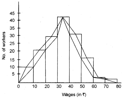
How is the frequency polygon different from the frequency curve? Present them through the line diagram, with the help of fictitious data.
Answer:
Difference between frequency polygon and frequency curve- Both, the frequency polygon and the frequency curve are drawn by joining the mid-points of the upper arms of the rectangles, but the basic difference between these two is that, the mid-points of the arms of rectangles in the frequency polygon are joined with the help of a scale (ruler). Whereas in a frequency curve these points are joined freehand. For this reason attractive angles are made in the polygon, whereas the frequency curve is smooth.
Presentation by Line Diagram – Create the frequency polygon, and frequency curve for the following data-
| Wages (in ₹ ) | 0-10 | 10-20 | 20-30 | 3040 | 40-50 | 50-60 | 60-70 | 70-80 |
| No. of Workers | 10 | 21 | 28 | 43 | 31 | 14 | 2 | 1 |
Solution :
Question 9.
Write a comment on Frequency diagram.
Answer:
Frequency Diagram -The data presented in the form of the grouped frequency distribution is usually presented by frequency diagrams, which include rectangle diagrams, frequency polygon, frequency curve and ogive, etc. The details of these are given below;
- Rectangular Diagram :
These are two dimensional diagrams. It is a set of rectangles in which intervals of limits (on the X-axis) work on the base and whose areas are in proportion to the square frequency. - Frequency Polygon :
The multi-sided diagram made on the basis of item values or mid¬points and mid-points and their frequencies is called frequency polygon. The diagram is prepared taking continuous/discrete series values on X-axis and frequencies on Y-axis. Then by joining the top most points together and joining the first and last points with the base line, the frequency polygon is constructed. - Frequency Curve :
A frequency curve is a smoothed form of frequency polygon. Frequency curve can be presented very easily by moving closest to the points (vertices) of frequency polygon and drawing a free-hand curve. It is not necessary that the frequency curve passes through all the points of frequency polygon, rather it passes closest to these points. - Ogive :
It is also called cumulative frequency curve.When the upper limits of class- intervals are taken on X-axis and cumulative frequencies are taken on Y-axis and a curve is thus plotted, it is called a cumulative frequency curve. Median and other division values(one-fourth, one-tenth, one-eighth, one-hundredth) can be easily determined with the help of cumulative frequency curves. These are of two-types-
Ogive curves are of two types
- Using upper limits of class-intervals and cumulative frequencies (less than)
- Using lower limits of class-intervals and cumulative frequencies(more than).
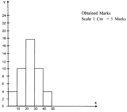
![]()
Question 10.
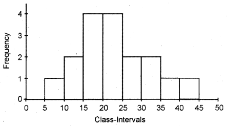
Create Frequency Polygon based on the following details of the marks obtained by students in the subject of Commerce.
| Obtained Marks | 0-10 | 10-20 | 20-30 | 30-40 | 40-50 |
| No. of Students | 4 | IQ | 17 | 10 | 4 |
Answer:
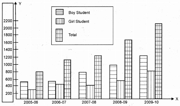
Question 11.
Display the following data with a multi-bar diagram.
Data- No. of students studies in class-11 in various academic sessions.
| Academic Session | Boy Students | Girl Students | Total |
| 2005-2006 | 500 | 300 | 800 |
| 2006-2007 | 700 | 450 | 1150 |
| 2007-2008 | 800 | 400 | 1200 |
| 2008-2009 | 1000 | 600 | 1600 |
| 2009-2010 | 1200 | 800 | 2000 |
Answer:
![]()
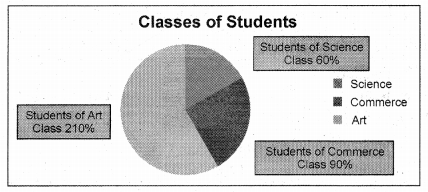
Question 12.
Adarsh Vidya Niketan, Udaipur has 600 students, 350 students of the arts class, 150 commerce class and 100 students of science class. Present them in a class- wise pie diagram.
Answer:
Data – No. of Students of Class
| Class | Students | Degree |
| Art Class | 350 | 210 |
| Commerce Class | 150 | 90 |
| Science Class | 100 | 60 |
| Total Students | 600 | 360 |
Because total 600 students are represented by 360°
Thus 350 students are represented by \(\frac { 360\times 350 }{ 600 } ={ 210 }^{ 0 }\)
150 students are represented by \(\frac { 360\times 150 }{ 600 } ={ 90 }^{ 0 }\)
100 students are represented by \(\frac { 360\times 100 }{ 600 } ={ 60 }^{ 0 }\)
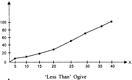
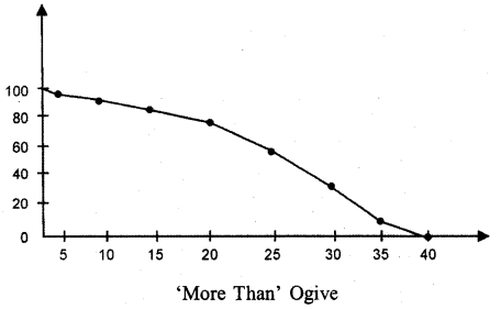
Question 13.
Make ‘less than’ ogive and ‘greater than’ ogive from the following summaries of the marks obtained by students in economics.
Answer:
Firstly ‘less than’, and ‘more than’ cumulative frequency tables will be created. After that the ogive will be made.
Cumulative Frequency Table
| Type ‘Less Than’ Type ‘More Than’ | |||
| Marks | Cumulative Frequency | Marks | Cumulative Frequency |
| ‘Less than’ 5 | 4 | ‘More than’- 0 | 100 |
| ‘Less than’ 10 | 4 + 6 = 10 | ‘More than’ 5 | 100 – 4 = 96 |
| ‘Less than’ 15 | 10+ 10 = 20 | ‘More than’ 10 | 96 – 6 = 90 |
| ‘Less than’ 20 | 20 + 10 = 30 | ‘More than’ 15 | 90 – 10 = 80 |
| ‘Less than’ 25 | 30 + 25 = 55 | ‘More than’ 20 | 80 – 10 = 70 |
| ‘Less than’ 30 | 55 + 22 = 77 | ‘More than’ 25 | 70 – 25 = 45 |
| ‘Less than’ 35 | 77 + 18 = 95 | ‘More than’ 30 | 45 – 22 = 23 |
| ‘Less than’ 40 | 95 + 5 = 100 | ‘More than’ 35 | 23 – 18 = 5 |
| ‘More than’ 40 | 5-5 = 0 | ||
![]()
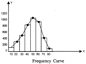
Question 14.
Prepare the Frequency Curve from the following data
| Age (in years) | 0-10 | 10-20 | 20-30 | 30-40 | 40-50 | 50-60 | 60-70 | 70-80 |
| Number of Residents | 150 | 300 | 500 | 800 | 1000 | 900 | 400 | 100 |
Answer:
A rectangle diagram will be created first from the received data, then the points will be marked in the middle of the tops of the rectangles. These points will be joined with free hand to get the forward frequency curve type :